Brand Identity Guidelines
Welcome to the PayMatch Brand Identity Guidelines. These guidelines ensure consistent representation of our brand across all touchpoints. Whether you're creating marketing materials, presentations, or digital content, following these guidelines helps maintain our brand's integrity and recognition.
Logo
Our logo is the cornerstone of our brand identity. It should be used consistently and never modified without authorization.
Logo Variations
LogoType
Both Themes
LogoType Dark
Light Theme
LogoType Light
Dark Theme
LogoMark
Both Themes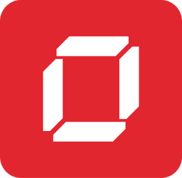
LogoMark Dark
Light Theme
LogoMark Light
Dark Theme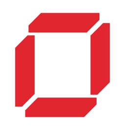
Correct Usage & Size Guidelines
Use the logo at the correct size and with adequate clear space. The diagram below shows minimum sizes and proper placement.
Logo Misuse
The following practices are strictly prohibited when using the PayMatch logo:
Brand Colors
Our color palette reflects our brand personality and values. Use these colors consistently across all brand materials.
Primary Colors
Primary colors are the main colors used in our visual identity. They are featured in our logo, website, and marketing materials.
Secondary Colors
Secondary colors complement the primary palette and add depth and versatility to branding materials.
Typography
Typography plays a crucial role in our brand communication. We use two primary typefaces: Poppins for headlines and Helvetica Now for body text.
Headlines
Body Text
This is copy text used for body content and paragraphs. It should be readable and comfortable for extended reading.
Caption text is used for smaller supporting information and metadata.
Usage Guidelines
Follow these guidelines to ensure proper brand representation:
Best Practices
- Always maintain clear space around the logo (minimum 20px)
- Use the appropriate logo variant for light or dark backgrounds
- Maintain the logo's aspect ratio when resizing
- Use brand colors consistently across all materials
- Follow typography guidelines for headlines and body text
- Ensure sufficient contrast for accessibility
- Request approval for any custom brand applications
Brand Assets
Download all brand assets including logo files in various formats and sizes.
Download Brand Assets